A series of mascot illustrations was created for the Brandenburg and Berlin health insurance fund IKK BB, featuring their energetic fox character Kikki.
The brief called for a friendly, character-driven visual style inspired by classic animation aesthetics, while strictly adhering to the corporate colors of IKK BB. The mascot was designed as a scalable vector illustration, allowing for flexible use across the company’s website as well as large-format print and digital advertising.
Based on the illustrated character, the advertising agency also commissioned a life-size costume for outdoor events and promotional appearances.
Services: Layout, typesetting, art direction, illustration
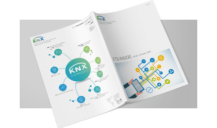
Client: KNX Association
Commissioned by: Designstudio Lange
On behalf of Designstudio Lange, we developed a range of magazines, flyers, and exhibition walls for the international training of KNX engineers, as well as for communication at trade fairs and training events worldwide.
The existing corporate design was consistently refined and expanded across multiple formats and use cases. A key focus was on supporting the clear visual language of the redesign while enhancing content-heavy sections through well-structured and visually engaging infographics.
Services: Corporate identity, company website, business stationery, construction site posters, two explainer videos
Client: TBI GmbH
Through a combination of hand-drawn illustrations, a custom-designed logo, and two explainer videos, we developed an approachable and friendly brand identity for the real estate developer TBI GmbH.
All communication materials created for the brand, including the website, business stationery, video teasers, and an explainer video for the solar townhouse, are connected through recurring hand-drawn key visuals. This consistent visual language helps the brand stand out while conveying clarity, accessibility, and trust across both digital and print media.
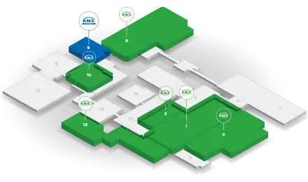
For the KNX booth at ISE 2020, we designed and prepared print templates and illustrated a range of infographics and guidance systems for trade fair displays.
In addition to classic print materials, we also developed animated content for digital displays used on site. The visual system supported clear orientation, structured information delivery, and consistent brand communication across both print and digital out-of-home formats.
Jugendkulturservice Berlin commissioned the creation of a cover illustration for the Super Holiday Pass. In close collaboration with the client, a wide range of summer activities and ideas was collected and translated into an initial sketch.
The result is a lively hidden-object illustration filled with playful details that invite exploration and spark anticipation for the holidays. The illustration was used as the central visual for the pass itself as well as for posters and flyers accompanying the campaign.
Services: Visual identity, video and print production, live direction, project management
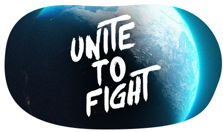
Client: Unite To Fight
Role: Co organization and design
Media: Livestream, social media, print
Style: 2D and 3D assets, clear and accessible visual language
Scope: 22 hour conference across 2 days
Reach: More than 10,000 registered participants
Accreditation: Up to 17 CME credits for healthcare professionals
Unite To Fight 2024 was the world’s largest conference on Long COVID and ME/CFS organized by patients. The project was developed as a long-term pro bono commitment with the aim of bringing together scientific expertise, patient perspectives and the work of international organizations, while drawing attention to the dramatic gaps in care and treatment.
The conference took place in May 2024 and featured 22 hours of programming across two days, with more than 10,000 participants from around the world. It brought together leading international experts in Long COVID and ME/CFS research. Renowned scientists presented the latest findings on post-acute infection syndromes. The program also included high level political and institutional voices, among them Prof. Karl Lauterbach and representatives of the World Health Organization, including WHO Director Maria van Kerkhove. Patient perspectives and advocacy organizations were an integral part of the program. The conference was CME accredited, allowing healthcare professionals to earn up to 17 CME credits.
Claus Ernst co-organized the conference and was responsible for the visual identity as well as the design and production of all video and print materials. This included animated content, visual frameworks for presentations and communication assets for social media. The goal was to create a clear and internationally accessible visual language that communicates complex content in a respectful and understandable way. In addition, he directed the live program via OBS. The international setup across multiple time zones required precise planning and close coordination within the team.
Unite To Fight 2024 received very positive feedback worldwide from researchers, patients, organizations and media outlets. The conference was widely covered nationally and internationally, including reporting by WDR, n tv, Radio Eins, Die Zeit, Süddeutsche Zeitung and other media.
„Winners of the day are the participants of the international conference on Long COVID and ME/CFS. […] The goal: to improve inadequate research and care. […] Perhaps the conference under the motto ‘Unite to Fight’ can help bring about change.“
Style: Detailed, colorful, acrylic, pencil, digital
Client: GSDH Creative Agency Cape Town
A poster illustration featuring various motifs characteristic of Cape Town, created for a creative agency. The illustration combines architectural elements, urban details, and local atmosphere into a vibrant visual composition that reflects the city’s unique character.
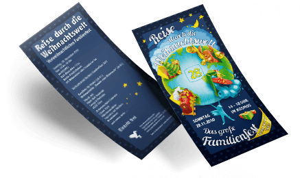
For Jugendkulturservice Berlin we designed a colorful Christmas flyer in DIN long format to promote a pre Christmas family event. The goal was to present the event in a friendly and inviting way while keeping all information clear and easy to read.
We created the illustration and developed the layout for the DIN long flyer, including typography and print ready artwork. The result is a small, charming piece of communication that reflects the festive character of the event and addresses families in a warm and approachable tone.